2020-2021
Milano Cortina 2026
- Brand Identity
- Global Event
- Sports Branding
- Public Engagement
- Olympic Games
- Sustainability
- Participation
A Winter Olympics identity reduced to its purest form.
Milano Cortina 2026 required a visual identity capable of redefining how the Winter Olympic and Paralympic Games could speak to a new generation. The challenge was not only to celebrate the legacy and prestige of the Games, but to express them through a more human, open, and contemporary perspective rooted in inclusion, sustainability, and participation.
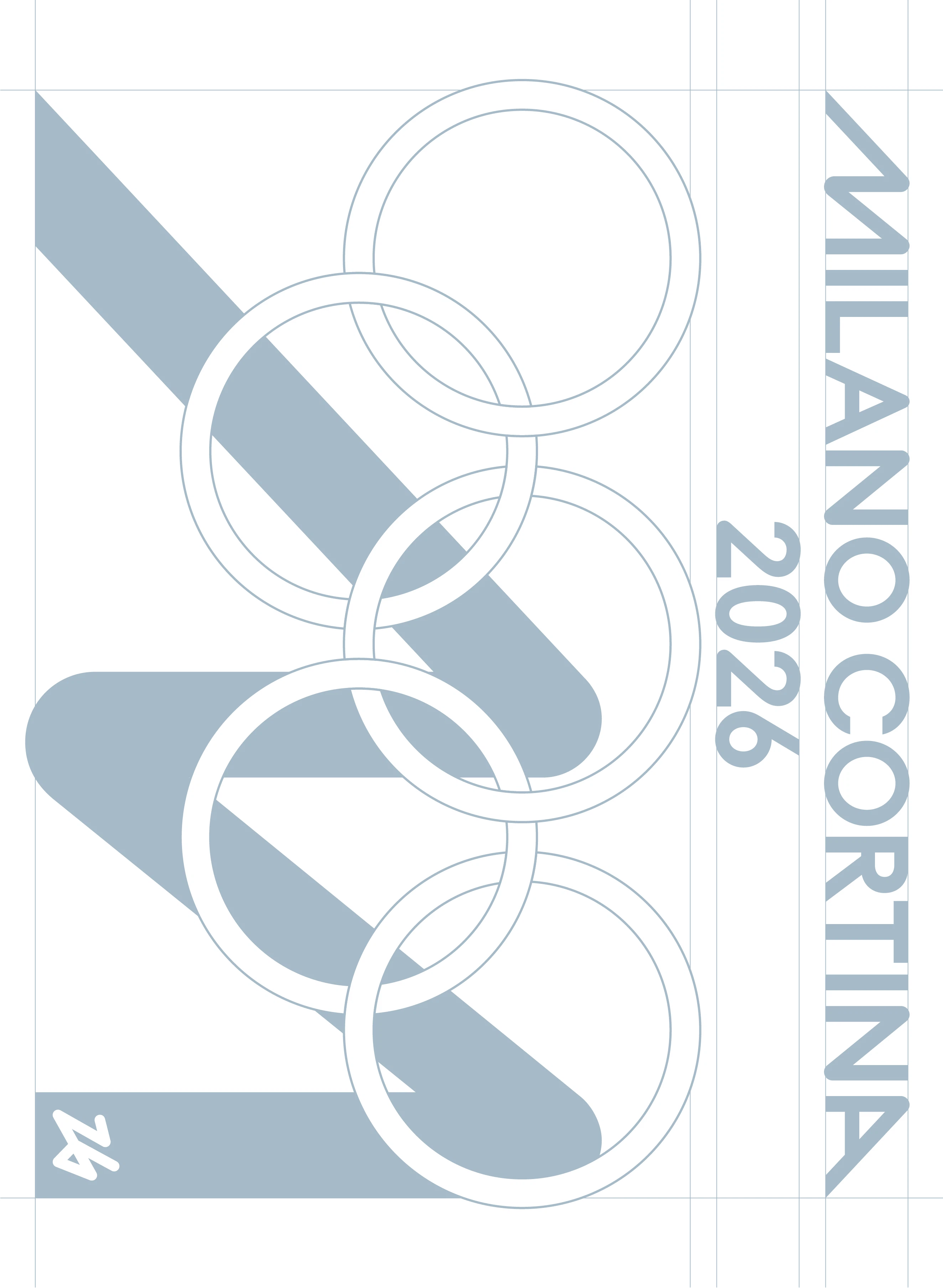
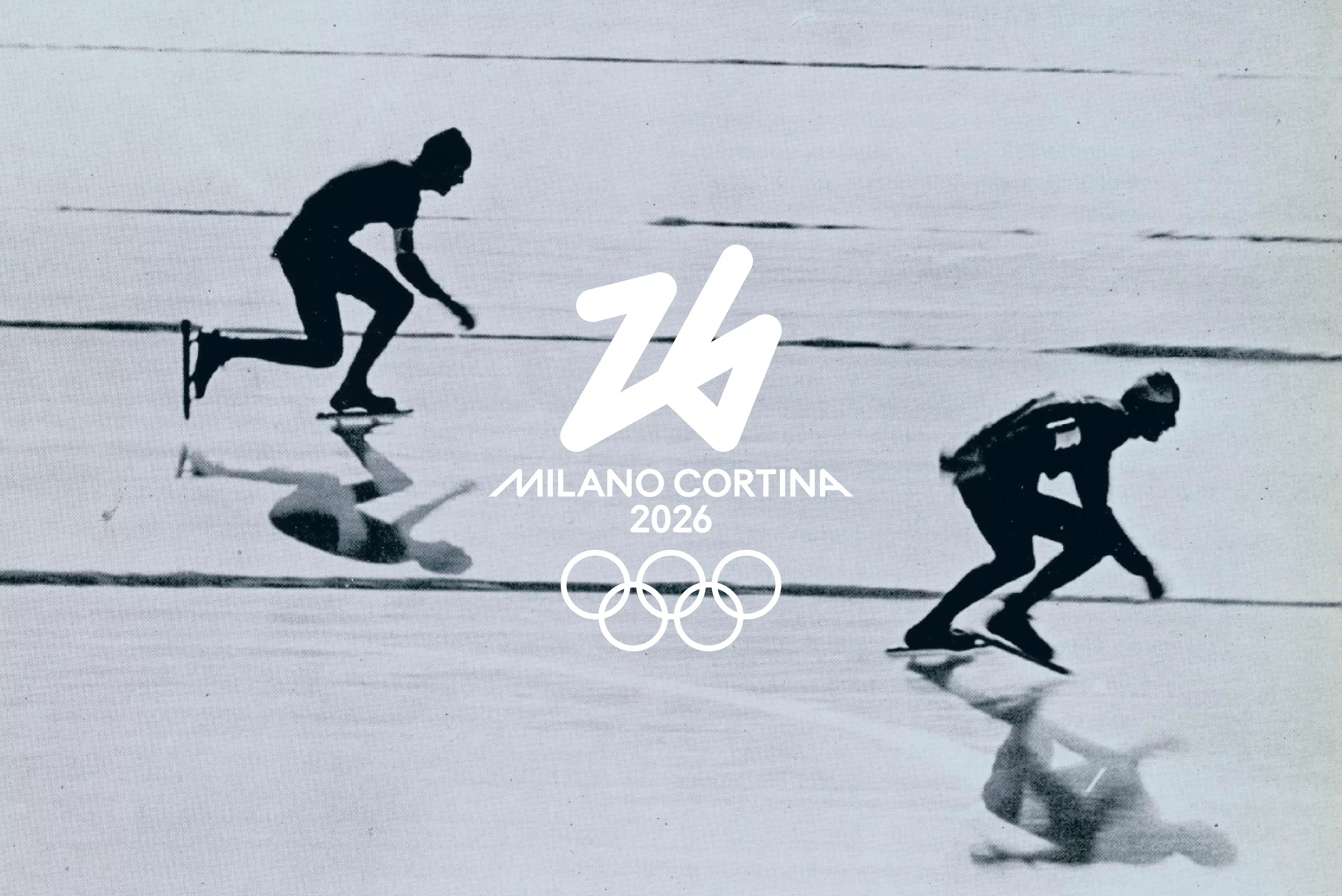
The emblem is built from a single continuous stroke, conceived as an intentional and instinctive gesture traced lightly into the snow. Minimal yet deeply symbolic, the mark transforms absence into presence and silence into energy, expressing the idea that even the simplest action can carry collective meaning and shape the future.
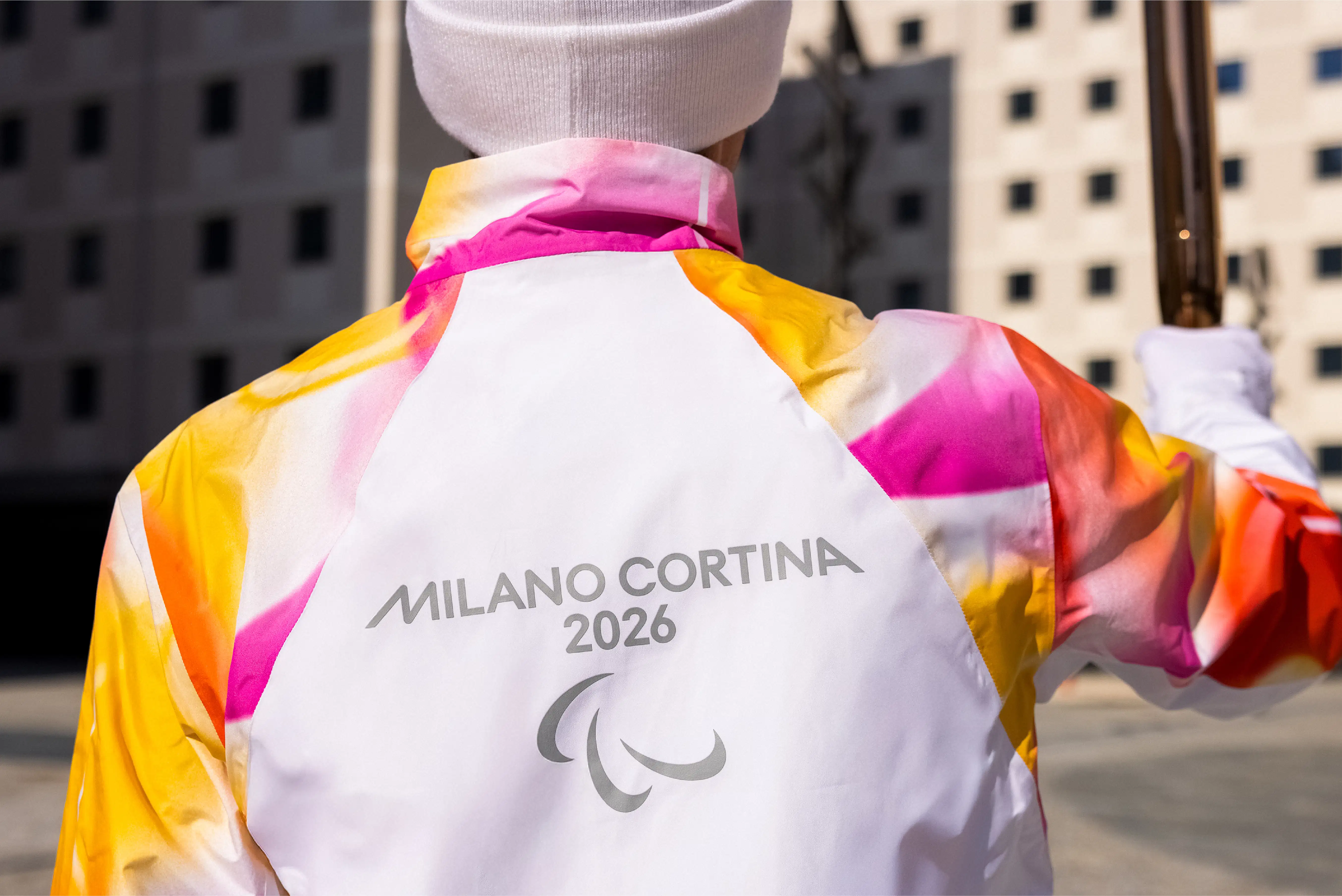
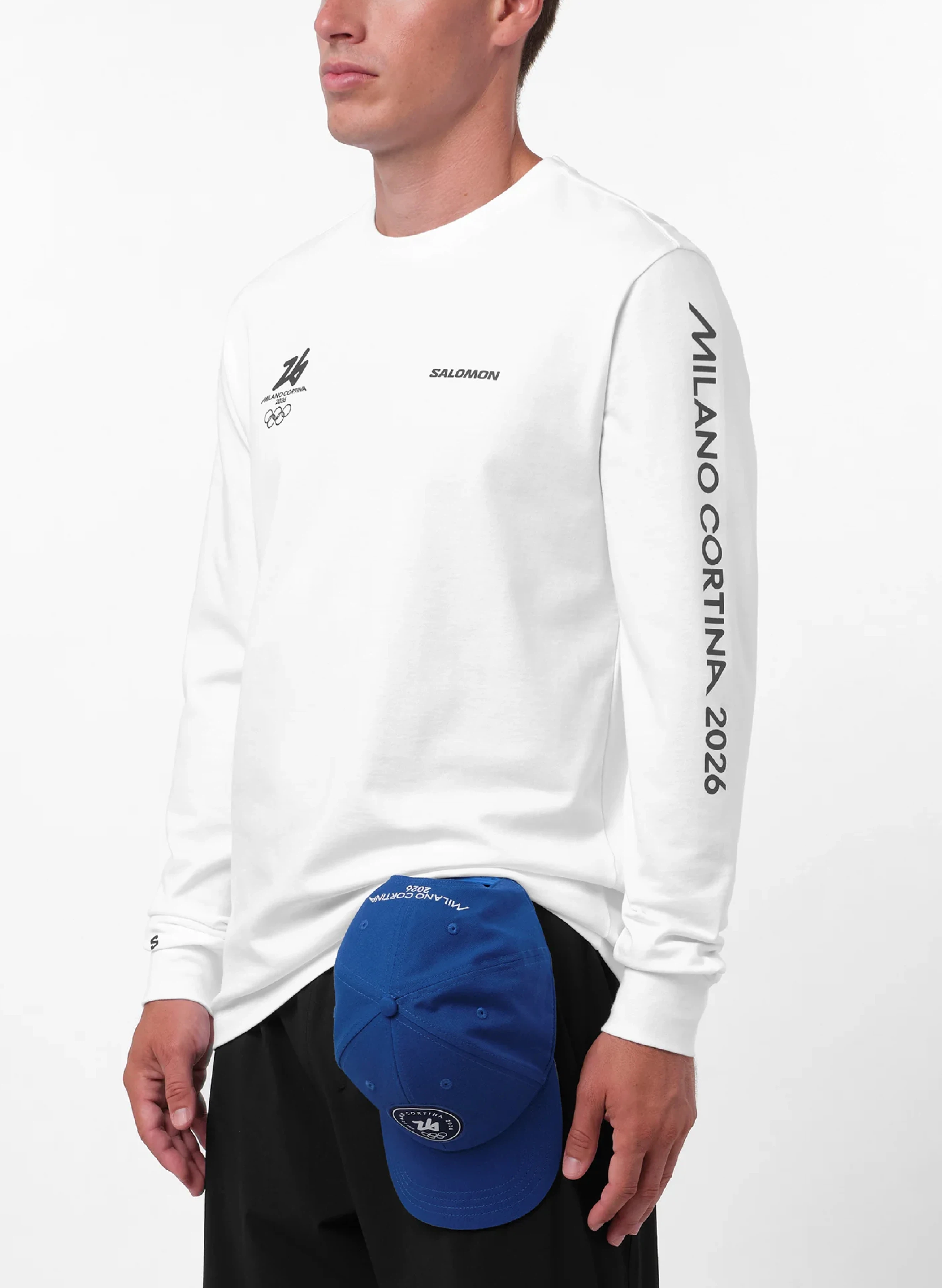
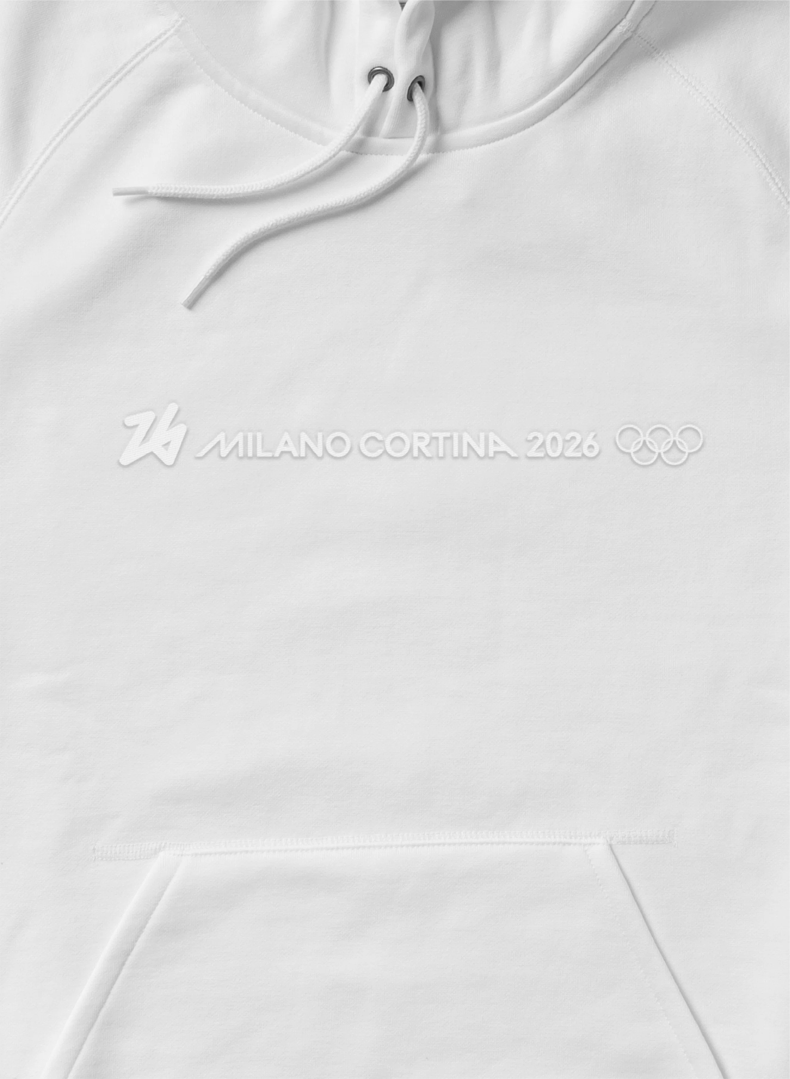
Entirely white, the identity uses reduction as a strategic statement. White becomes more than a colour: it evokes winter landscapes, reflects the purity and fragility of nature, and symbolises inclusion through the idea of white as the sum of all colours. The result is a visual language that feels essential yet emotionally charged, capable of communicating across cultures and generations with immediacy and clarity.
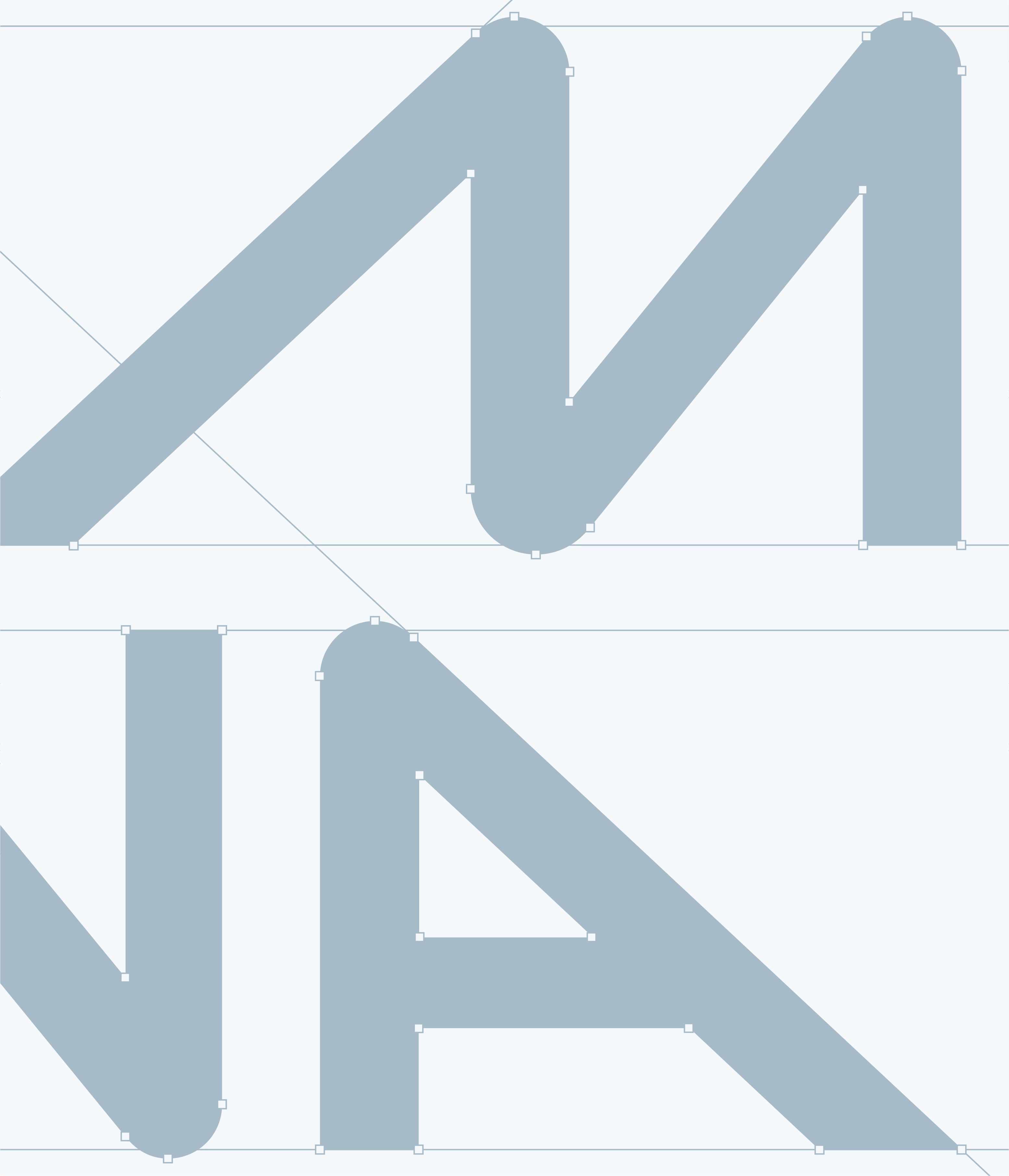
The wordmark draws inspiration from mountain peaks and athletic momentum, creating a dialogue between the two host cities while reinforcing movement, elevation, and ambition. Across the wider system, the identity balances Olympic and Paralympic narratives through a shared visual language that embraces diversity without losing consistency.
The result is an identity that shifts the perception of the Winter Games from monumental spectacle to collective experience, transforming a simple gesture into a universal symbol of openness, optimism, and human connection.


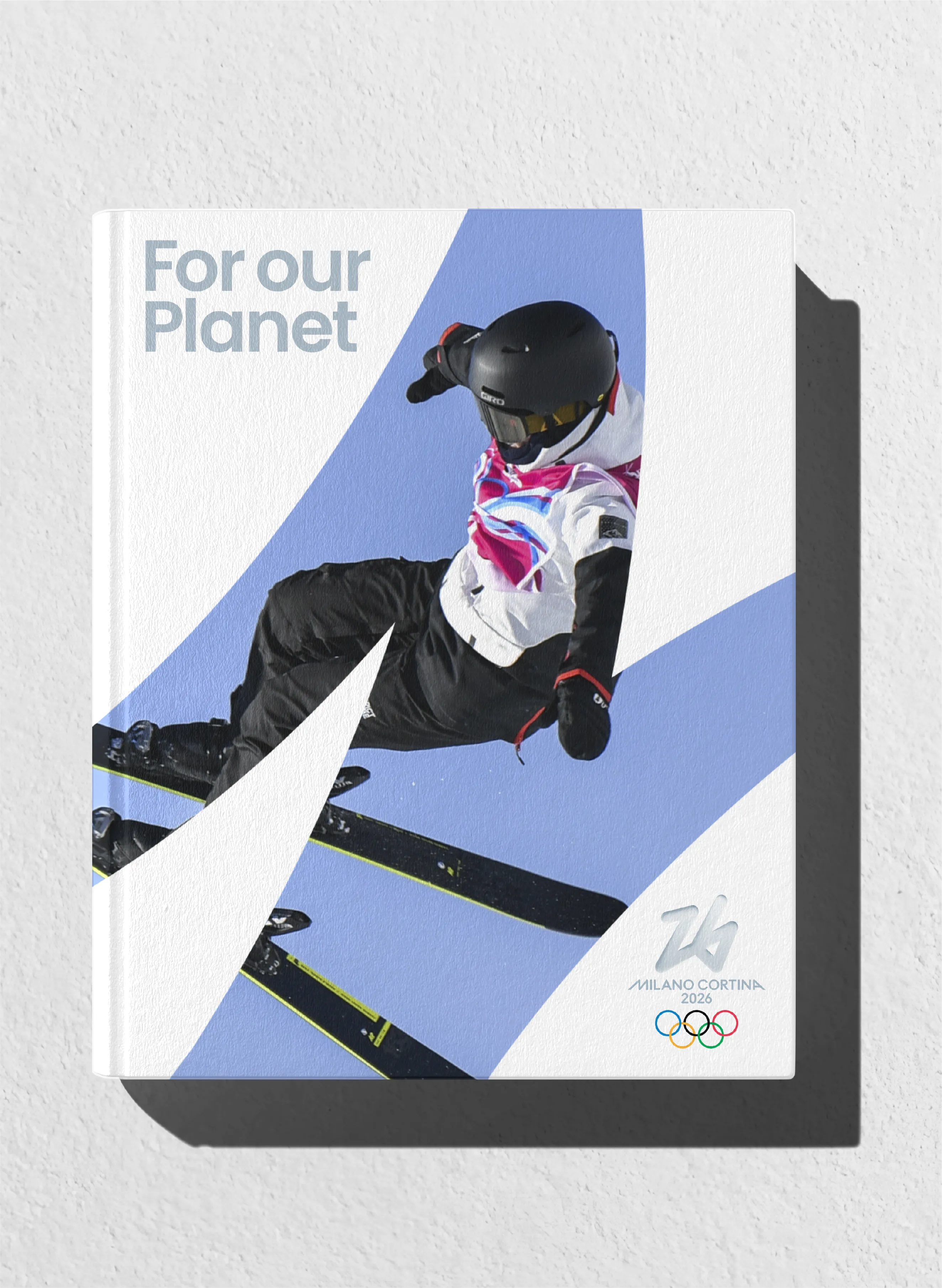
Built from a single continuous stroke, the emblem transforms a spontaneous gesture into a symbol of collective participation and future optimism.





The visual system transforms absence into presence, using simplicity to create emotional resonance and symbolic depth.