2018
Pinocchio
- Research
- Editorial Design
- Book Design
- Typography
- Italian Literature
- Experimental Publishing
Pinocchio is an experimental editorial reinterpretation of Carlo Collodi’s original novel. The project explores how the physical and typographic language of a book can become an interpretative device, allowing editorial design to actively participate in the construction of meaning.
The research combines historical analysis of the original publication and more than forty editions of Pinocchio with the theatrical interpretation developed by Carmelo Bene. In Bene’s reading, Pinocchio’s transformation into a “real boy” is no longer a happy ending, but the loss of innocence, instinct, and authenticity. Education becomes a metaphor for conformity, while adulthood represents the gradual abandonment of one’s original nature.
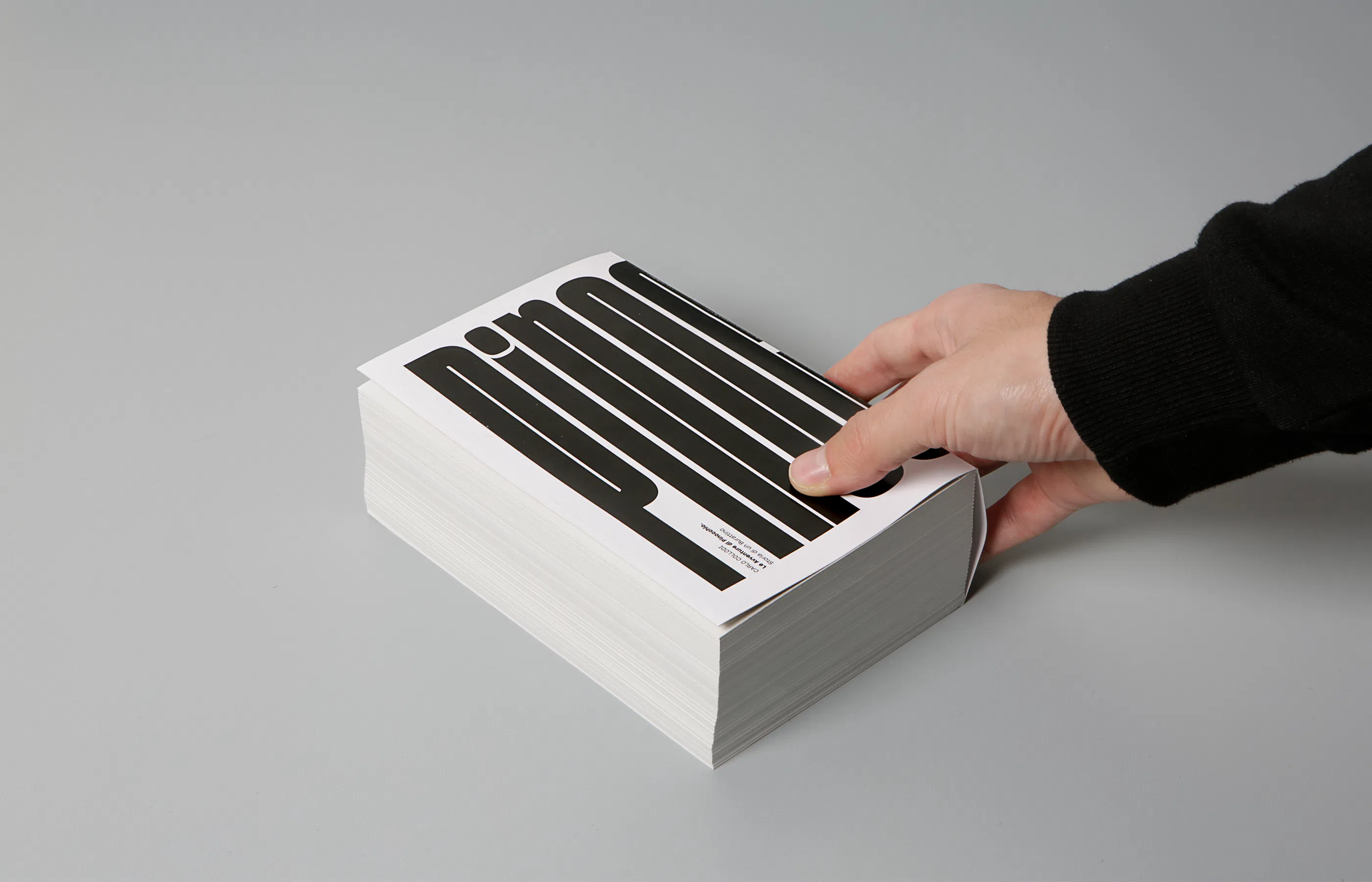
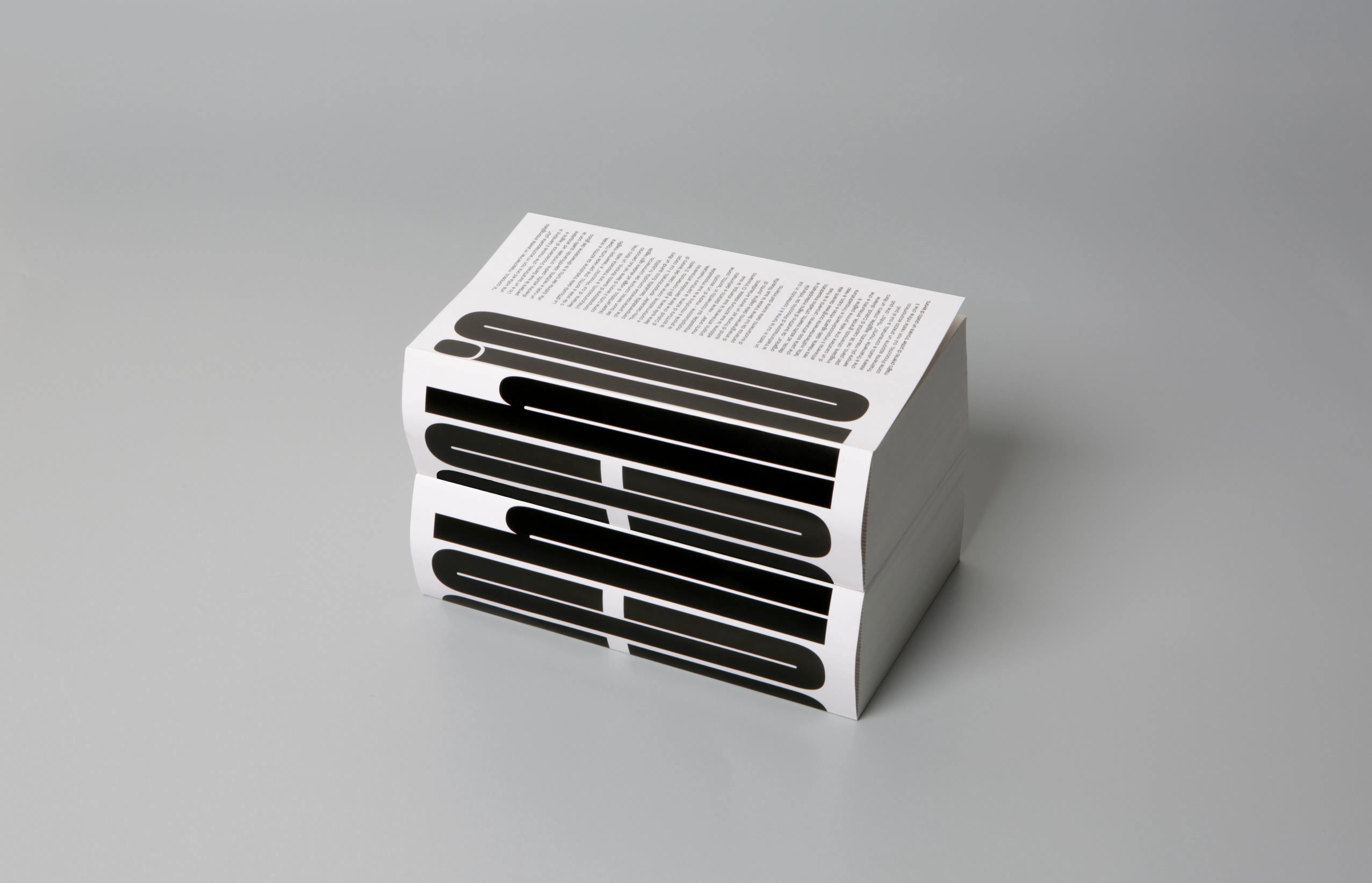
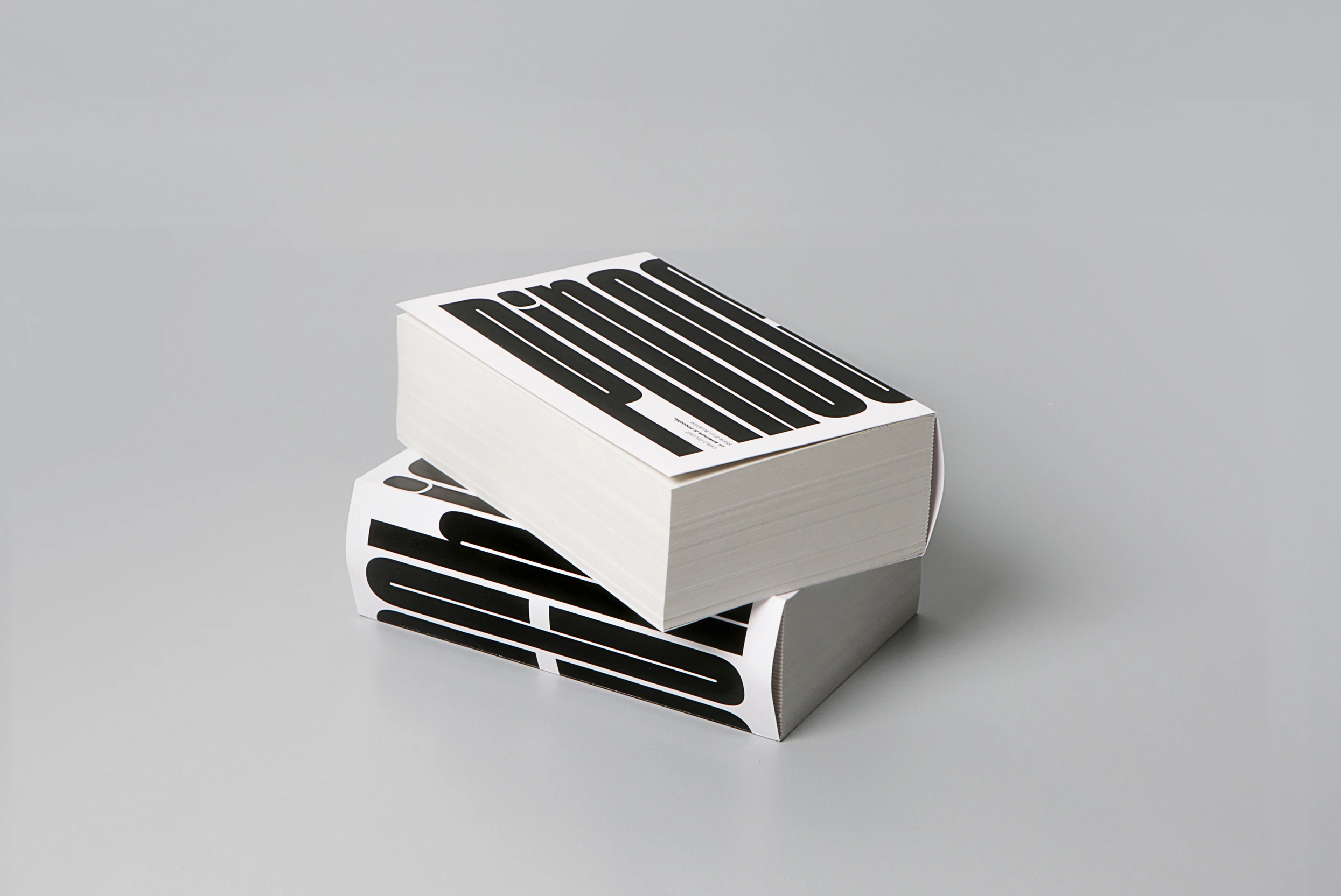
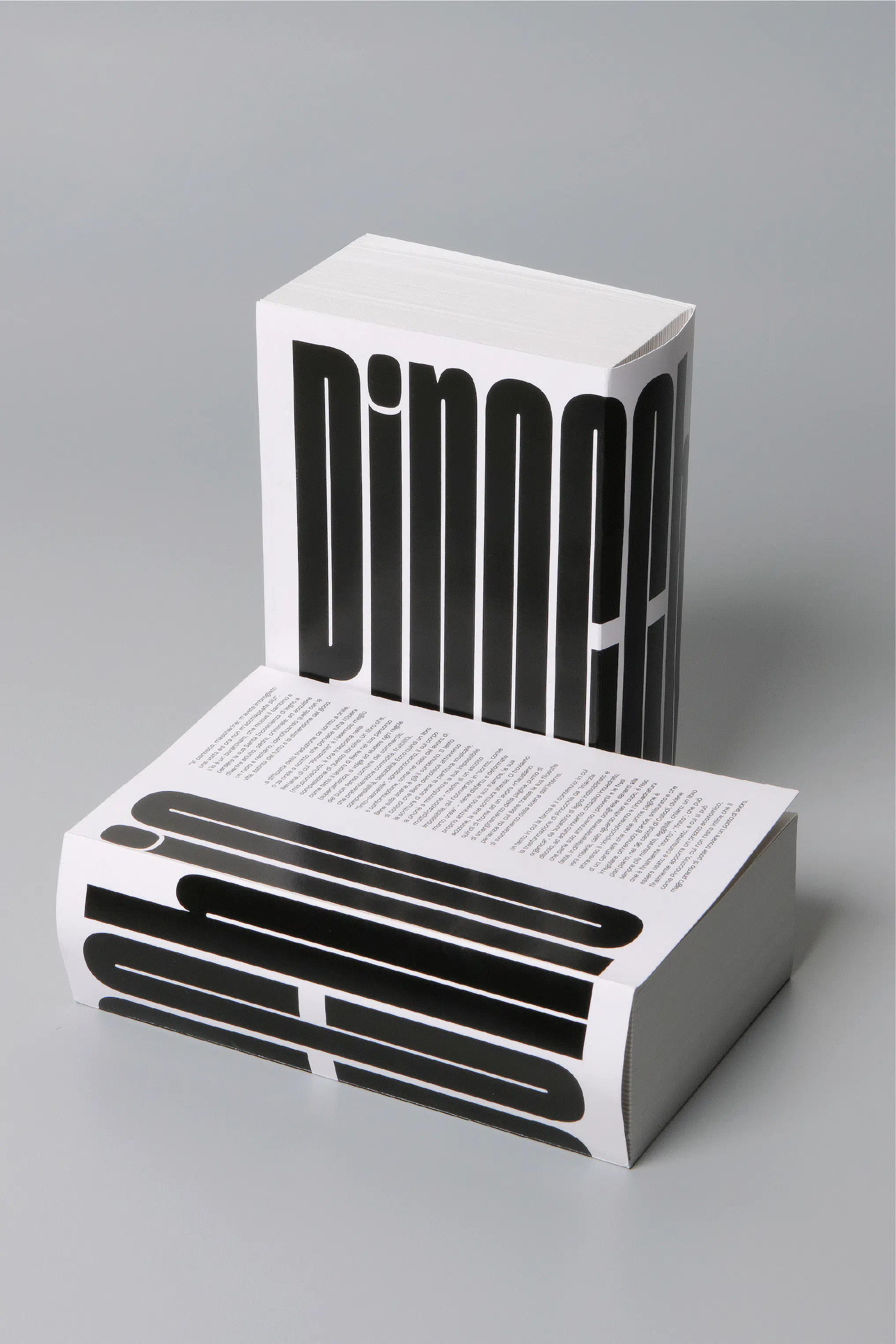
This interpretation begins on the cover. As the title wraps around the book, only the letters “io” remain visible on the front, the Italian word for “I”. A subtle visual gesture introduces the central theme of the project: the gradual dissolution of the self.
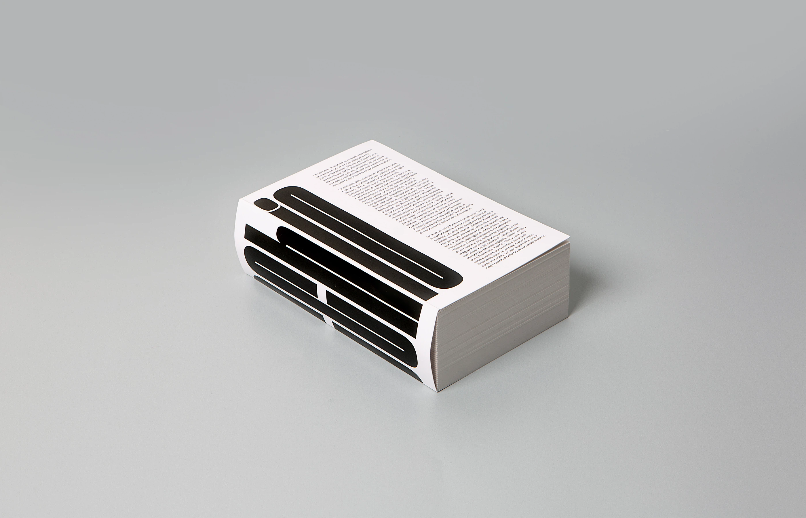
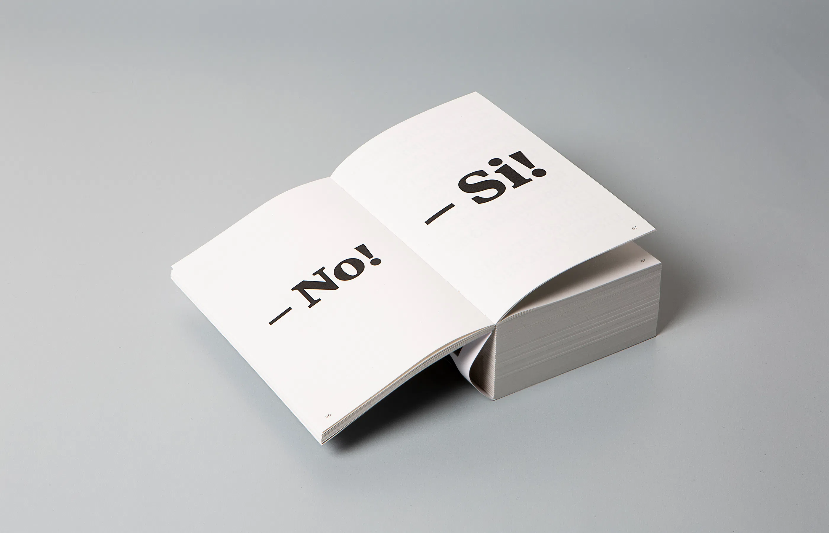
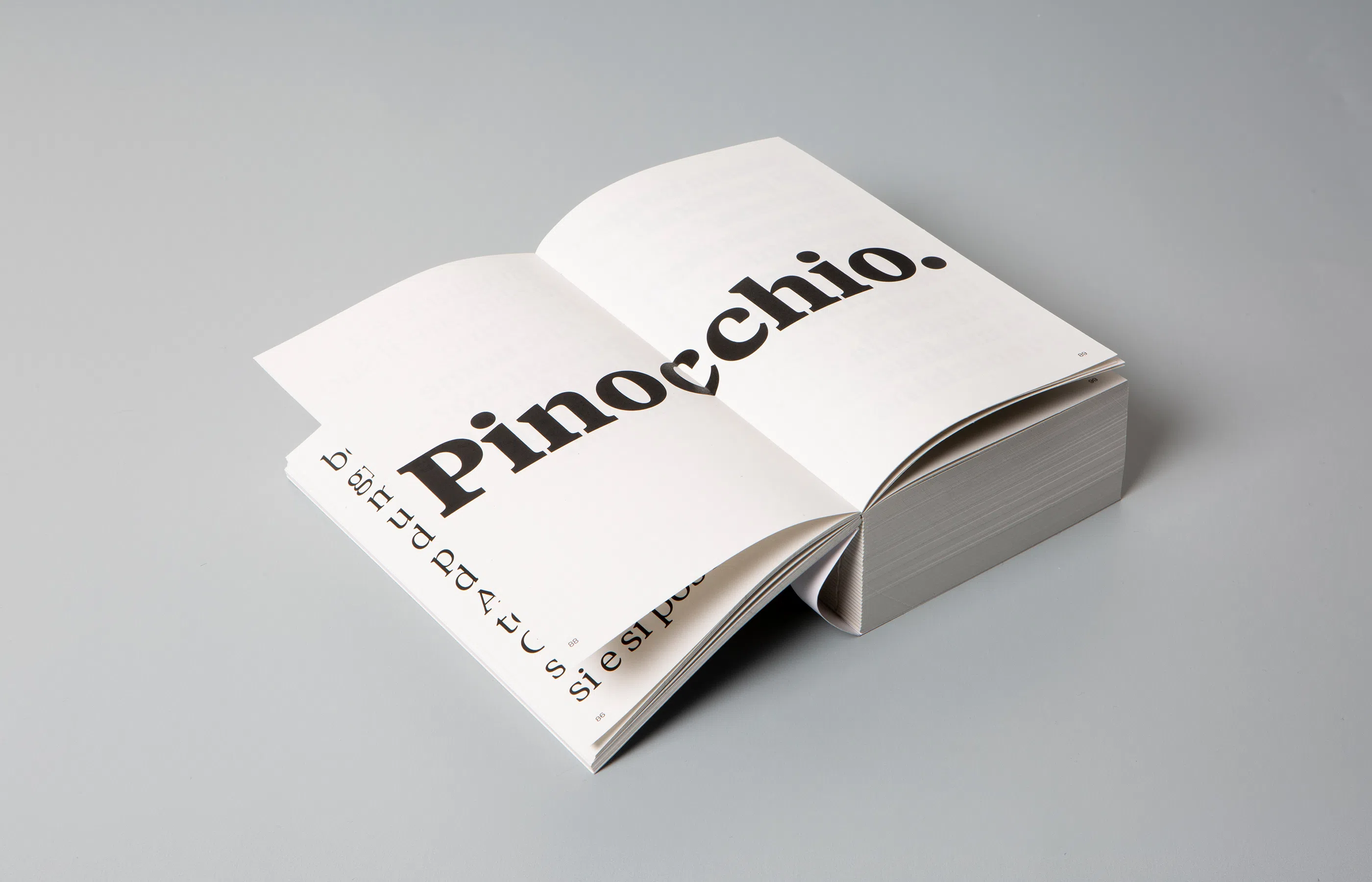
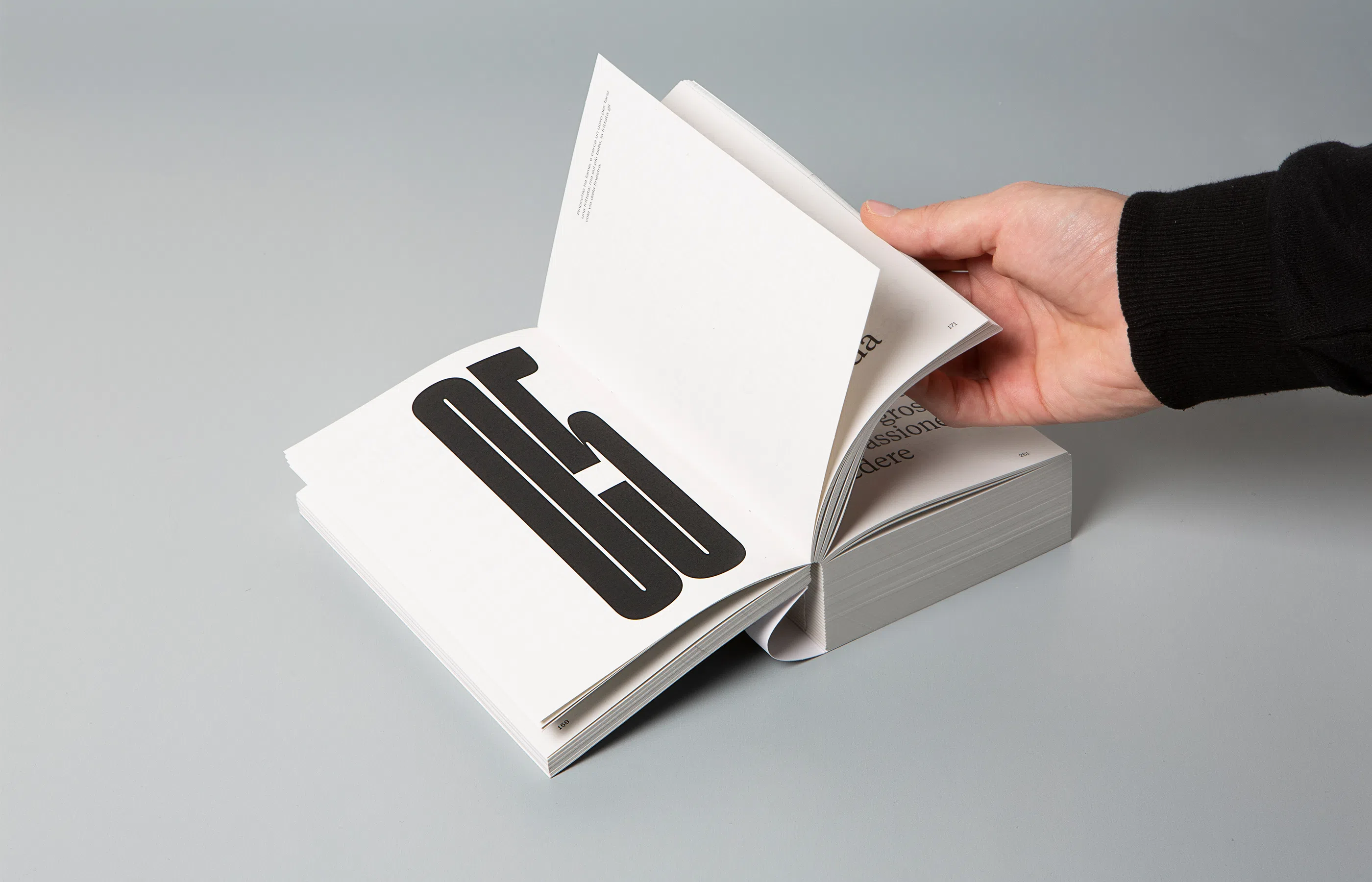
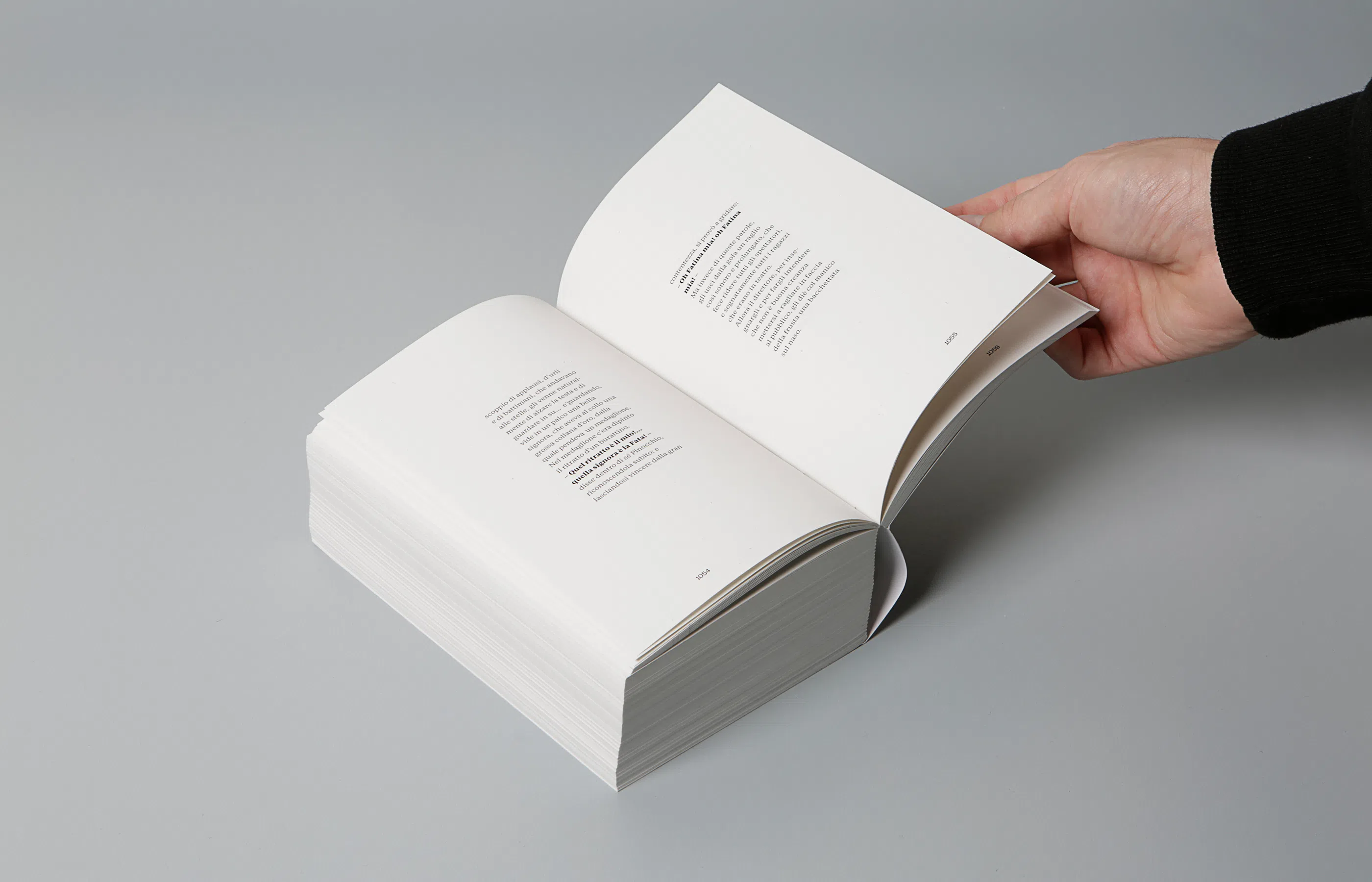
The project questions the traditional role of the book as a passive support for literature. Every typographic decision contributes to the storytelling, demonstrating how editorial design can reinterpret a classic through the language of the book itself, where form and content evolve together until they become inseparable.
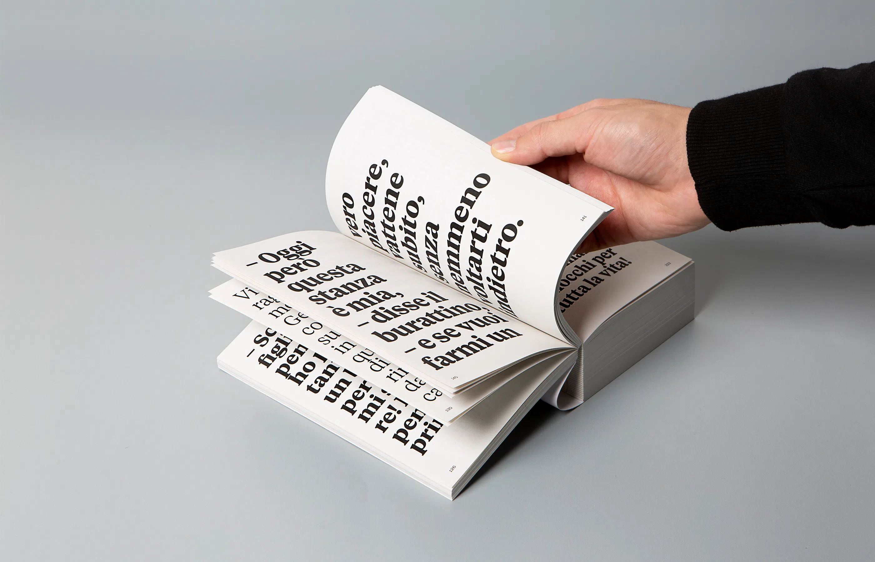
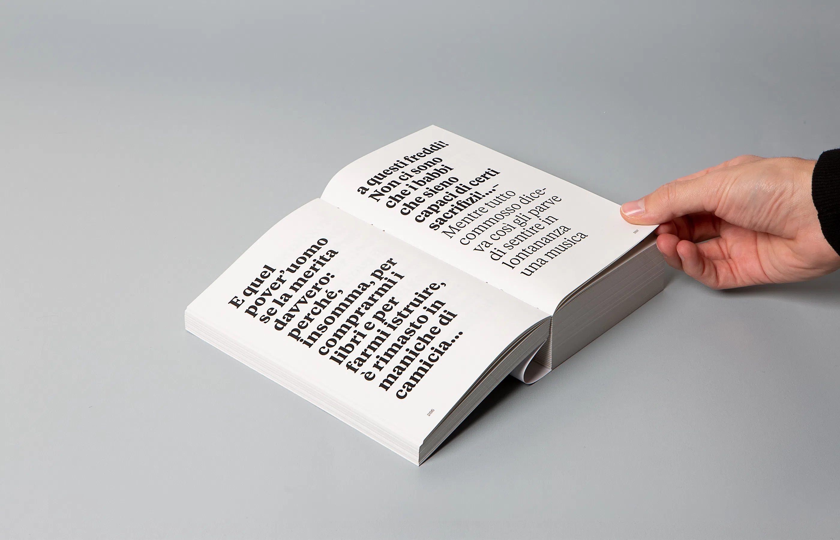
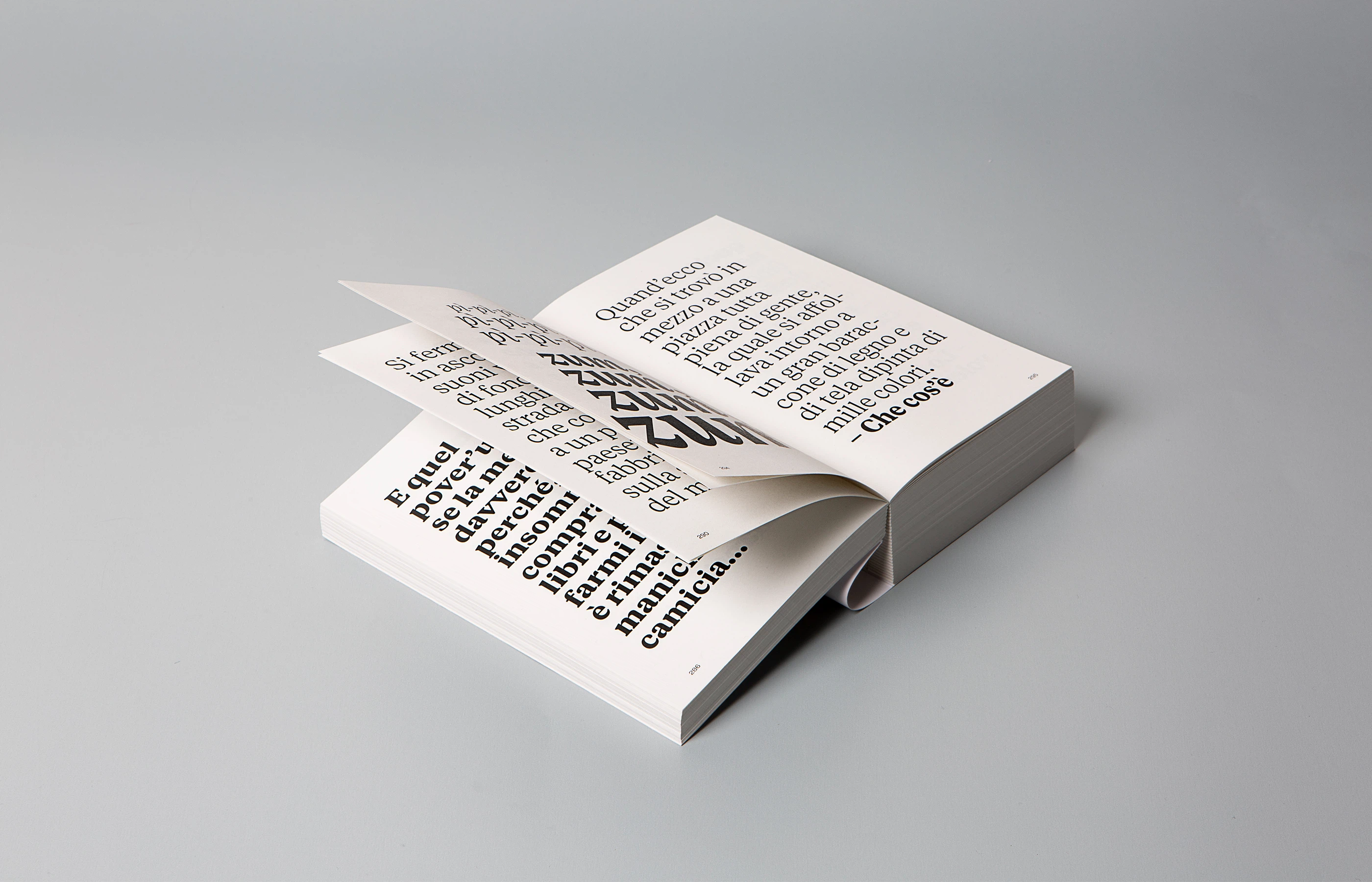
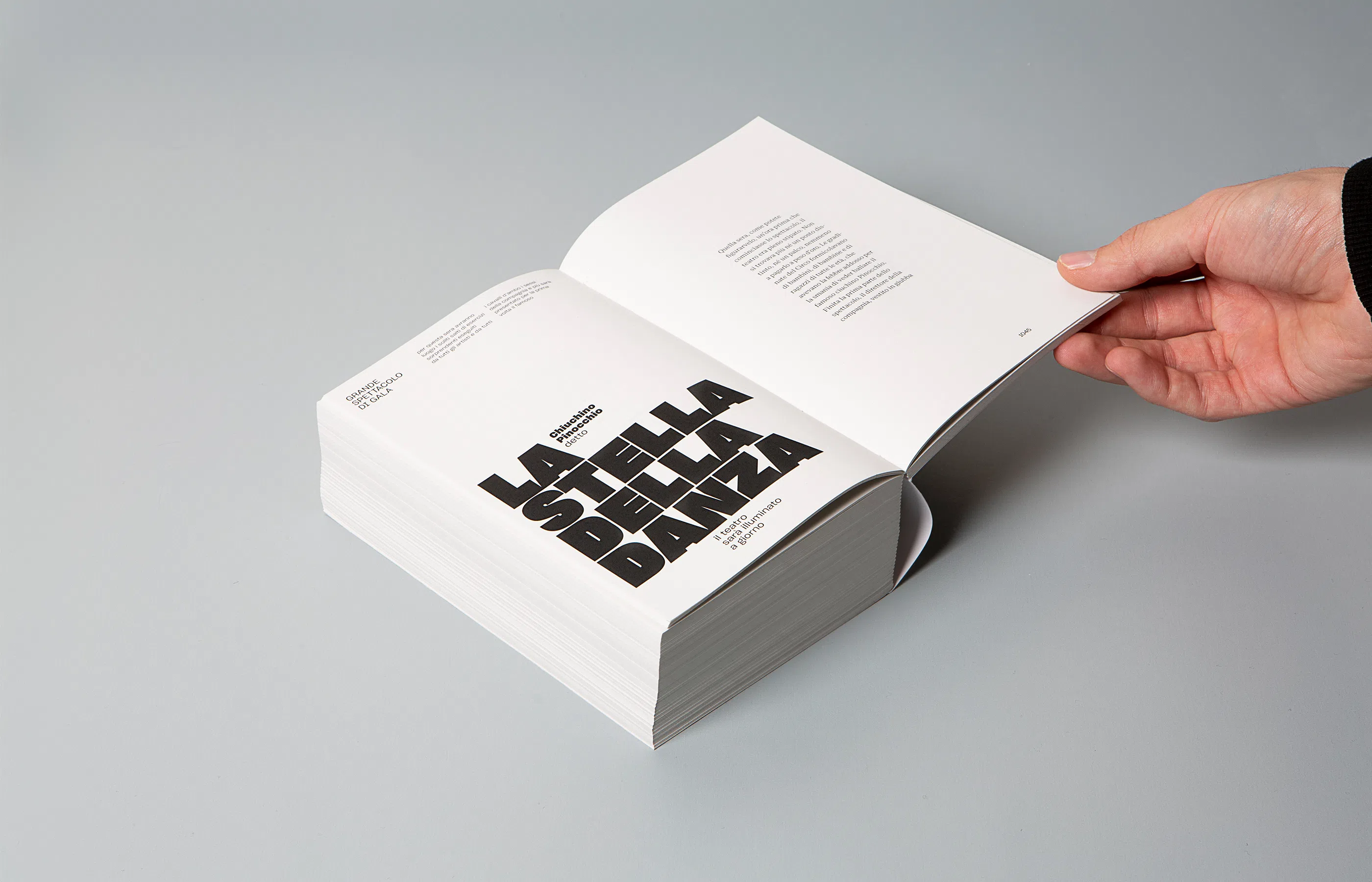
Inspired by Massin’s expressive typographic work for La Cantatrice Chauve, the publication progressively transforms as the story unfolds. Type size, leading, margins, and page structure gradually contract, visually mirroring Pinocchio’s loss of freedom and individuality. The book itself experiences the same process of compression and homogenisation as its protagonist, turning editorial design into a narrative device, not just a neutral container for text.